The Long Game Playbook
From a marketing campaign to a full-blown road show presentation to a PDF booklet, The Long Game Playbook was a brand challenge like no other. The initial task I was presented: brand a 4-week email series. This series evolved into a traveling “road show” that took place in 10 cities across America.
The road show included a presentation deck, a printed “playbook” document for attendees, website RSVP landing pages for each city, and subsequent email automations for event confirmation and reminders. The campaign was built around the producing company’s four elements of a craft brewery business—Taproom, Distribution, Operations, Leadership—and encouraged brewery owners to commit to a "long game" mindset.
Type
Brand Campaign
Year
2022
Programs + Skills
Photoshop, Illustrator, InDesign, Email Automation, WordPress, HTML/CSS, PowerPoint
Inspiration
The Long Game Playbook was initially inspired by an actual sports playbook with its raw visual identity and scribbled handwritten design. As the campaign morphed beyond the digital into a physical event, much of the core design intent remained yet some assets were updated to further communicate the traveling nature of the event and ensure readability beyond web only formats.
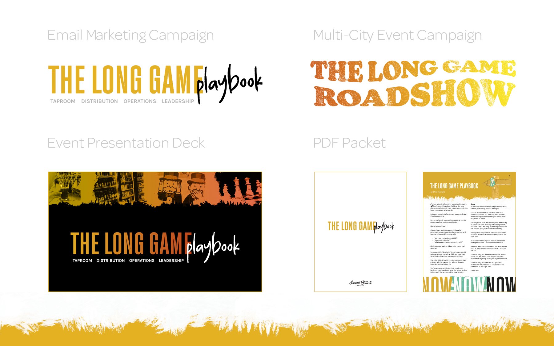
The Long Game Roadshow alluded to the iconic 1970s fonts and color palette embraced by traveling musical acts. This development bridged the gap between the visual identity of the email series—white, gold, black and teal on a white background—and the presentation deck which drew upon muted yellow, orange, and red hues against a black backdrop.
Presentation Deck Samples
This presentation was given a darker color scheme with higher contrast to support a variety of projectors with varying quality output. It also allowed for implementation of The Long Game Roadshow 1970s-inspired color scheme.
Landing Pages
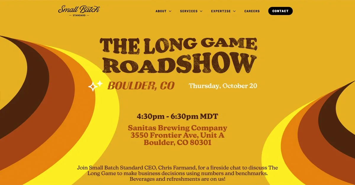
Two landing page examples showcasing the 1970s color scheme and retro design concept.
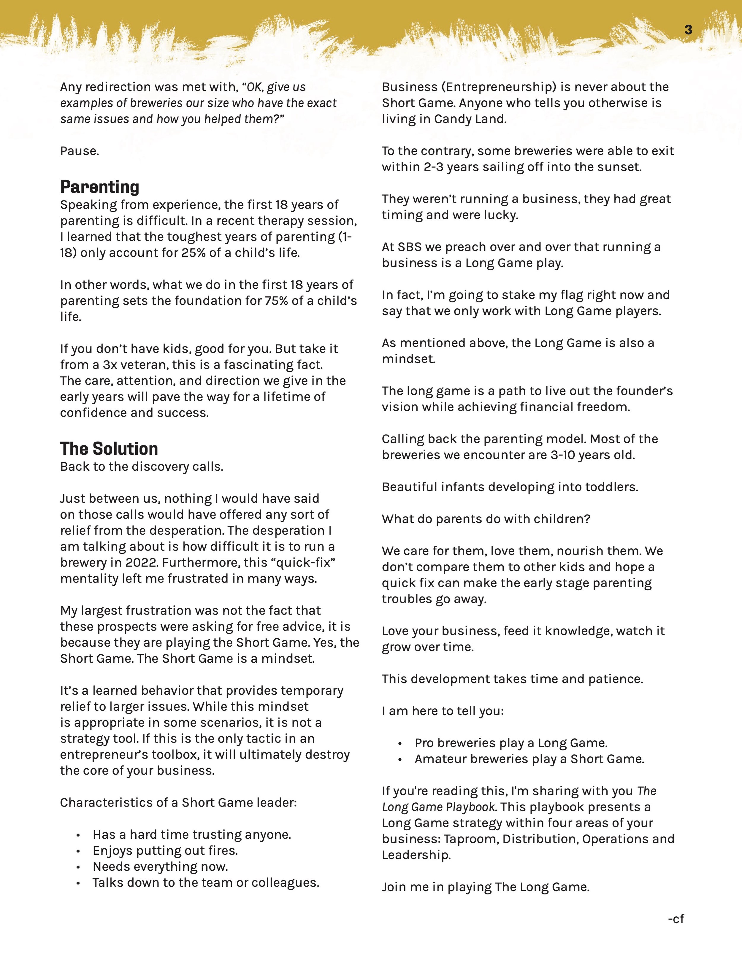
PDF Packet
Packet created for those attending The Long Game presentation. To ensure that the PDF was printer friendly, the lighter color scheme from the email campaign was implemented.

